By the end of this project, you will create different types of charts and graphs using Excel spreadsheets and built interactive dashboards. You will acquire basic skills needed to manipulate and create data visualizations and their importance for storytelling. This project is a first step in the development of data visualizations and telling a story.
Class Deals by MOOC List - Click here and see Coursera's Active Discounts, Deals, and Promo Codes.
We will learn about the importance of charts and graphs and how they are able to shape our data providing meaningful information for decision making. Also, we will understand if we have a clean and clear data visualizations we will have a much clear picture of what is happening with our data.
In this Guided Project, you will:
- Create an Excel for the Web account.
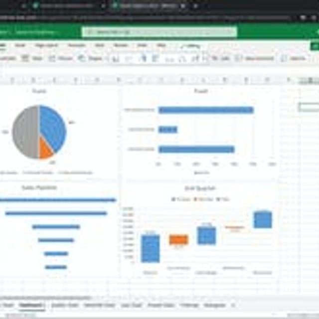
- Create pie, bar, line, scatter, funnel, waterfall, histograms and treemaps charts using Excel spreadsheets.
- Create an interactive dashboard and understand the importance of data visualizations.
Learn step-by-step
- Data Visualization and more
- Creating an Interactive Dashboard
- Create Funnel and Waterfall Charts
- Create Histograms and Treemaps Charts
- Create Scatter and Line Charts
- Create Pie and Bar Charts
- Create an Excel for the Web account
Go to Class
MOOC List is learner-supported. When you buy through links on our site, we may earn an affiliate commission.