Understanding and Visualizing Data with Python (Coursera)

Understanding and Visualizing Data with Python (Coursera)

In this course, learners will be introduced to the field of statistics, including where data come from, study design, data management, and exploring and visualizing data. Learners will identify different types of data, and learn how to visualize, analyze, and interpret summaries for both univariate and multivariate data. Learners will also be introduced to the differences between probability and non-probability sampling from larger populations, the idea of how sample estimates vary, and how inferences can be made about larger populations based on probability sampling.

Class Deals by MOOC List - Click here and see Coursera's Active Discounts, Deals, and Promo Codes.

At the end of each week, learners will apply the statistical concepts they’ve learned using Python within the course environment. During these lab-based sessions, learners will discover the different uses of Python as a tool, including the Numpy, Pandas, Statsmodels, Matplotlib, and Seaborn libraries. Tutorial videos are provided to walk learners through the creation of visualizations and data management, all within Python. This course utilizes the Jupyter Notebook environment within Coursera.

What You Will Learn

  • Properly identify various data types and understand the different uses for each
  • Create data visualizations and numerical summaries with Python
  • Communicate statistical ideas clearly and concisely to a broad audience
  • Identify appropriate analytic techniques for probability and non-probability samples

Course 1 of 3 in the Statistics with Python Specialization.

Syllabus

WEEK 1 - Introduction to Data
In the first week of the course, we will review a course outline and discover the various concepts and objectives to be mastered in the weeks to come. You will get an introduction to the field of statistics and explore a variety of perspectives the field has to offer. We will identify numerous types of data that exist and observe where they can be found in everyday life. You will delve into basic Python functionality, along with an introduction to Jupyter Notebook. All of the course information on grading, prerequisites, and expectations are on the course syllabus and you can find more information on our Course Resources page.

WEEK 2 - Univariate Data
In the second week of this course, we will be looking at graphical and numerical interpretations for one variable (univariate data). In particular, we will be creating and analyzing histograms, box plots, and numerical summaries of our data in order to give a basis of analysis for quantitative data and bar charts and pie charts for categorical data. A few key interpretations will be made about our numerical summaries such as mean, IQR, and standard deviation. An assessment is included at the end of the week concerning numerical summaries and interpretations of these summaries.

WEEK 3 - Multivariate Data
In the third week of this course on looking at data, we’ll introduce key ideas for examining research questions that require looking at more than one variable. In particular, we will consider both numerically and visually how different variables interact, how summaries can appear deceiving if you don’t properly account for interactions, and differences between quantitative and categorical variables. This week’s assignment will consist of a writing assignment along with reviewing those of your peers.

WEEK 4 - Populations and Samples
In this week, you’ll spend more time thinking about where data come from. The highest-quality statistical analyses of data will always incorporate information about the process used to generate the data, or features of the data collection design. You’ll be exposed to important concepts related to sampling from larger populations, including probability and non-probability sampling, and how we can make inferences about larger populations based on well-designed samples. You’ll also learn about the concept of a sampling distribution, and how estimation of the variance of that distribution plays a critical role in making statements about populations. Finally, you’ll learn about the importance of reading the documentation for a given data set; a key step in looking at data is also looking at the available documentation for that data set, which describes how the data were generated.

Go to Class
MOOC List is learner-supported. When you buy through links on our site, we may earn an affiliate commission.

Related Courses

Fundamentals of Engineering Exam Review (Coursera) Coursera
Georgia Institute of Technology

Fundamentals of Engineering Exam Review (Coursera)

The purpose of this course is to review the material covered in the Fundamentals of Engineering (FE) exam to enable the student to pass it. It will be presented in modules corresponding to the FE topics, particularly those in Civil and Mechanical Engineering. Each module will review main concepts, illustrate them with examples, and provide extensive practice problems.

Oct 5th 2026
5-12 Weeks
An Introduction to Interactive Programming in Python (Part 1) (Coursera) Coursera
Rice University

An Introduction to Interactive Programming in Python (Part 1) (Coursera)

This two-part course is designed to help students with very little or no computing background learn the basics of building simple interactive applications. Our language of choice, Python, is an easy-to learn, high-level computer language that is used in many of the computational courses offered on Coursera. To make learning Python easy, we have developed a new browser-based programming environment that makes developing interactive applications in Python simple.

Oct 5th 2026
5-12 Weeks
Python and Statistics for Financial Analysis (Coursera) Coursera
The Hong Kong University of Science and Technology - HKUST

Python and Statistics for Financial Analysis (Coursera)

Python is now becoming the number 1 programming language for data science. Due to python’s simplicity and high readability, it is gaining its importance in the financial industry. The course combines both python coding and statistical concepts and applies into analyzing financial data, such as stock data.

Oct 5th 2026
4 Weeks
Supply Chain Analytics Essentials (Coursera) Coursera
Rutgers University

Supply Chain Analytics Essentials (Coursera)

In this introductory course to Supply Chain Analytics, I will take you on a journey to this fascinating area where supply chain management meets data analytics. You will learn real life examples on how analytics can be applied to various domains of a supply chain, from selling, to logistics, production and sourcing, to generate a significant social / economic impact.

Oct 5th 2026
4 Weeks
Principles of Computing (Part 2) (Coursera) Coursera
Rice University

Principles of Computing (Part 2) (Coursera)

This two-part course introduces the basic mathematical and programming principles that underlie much of Computer Science. Understanding these principles is crucial to the process of creating efficient and well-structured solutions for computational problems. To get hands-on experience working with these concepts, we will use the Python programming language. The main focus of the class will be weekly mini-projects that build upon the mathematical and programming principles that are taught in the class.

Oct 5th 2026
4 Weeks
Population Health: Responsible Data Analysis (Coursera) Coursera
Leiden University

Population Health: Responsible Data Analysis (Coursera)

In most areas of health, data is being used to make important decisions. As a health population manager, you will have the opportunity to use data to answer interesting questions. In this course, we will discuss data analysis from a responsible perspective, which will help you to extract useful information from data and enlarge your knowledge about specific aspects of interest of the population.

Oct 5th 2026
4 Weeks
From Excel to Power BI (Coursera) Coursera
Knowledge Accelerators

From Excel to Power BI (Coursera)

Are you using Excel to manage, analyze, and visualize your data? Would you like to do more? Perhaps you've considered Power BI as an alternative, but have been intimidated by the idea of working in an advanced environment. The fact is, many of the same tools and mechanisms exist across both these Microsoft products. This means Excel users are actually uniquely positioned to transition to data modeling and visualization in Power BI! Using methods that will feel familiar, you can learn to use Power BI to make data-driven business decisions using large volumes of data.

Oct 5th 2026
1 Week
Global Warming II: Create Your Own Models in Python (Coursera) Coursera
University of Chicago

Global Warming II: Create Your Own Models in Python (Coursera)

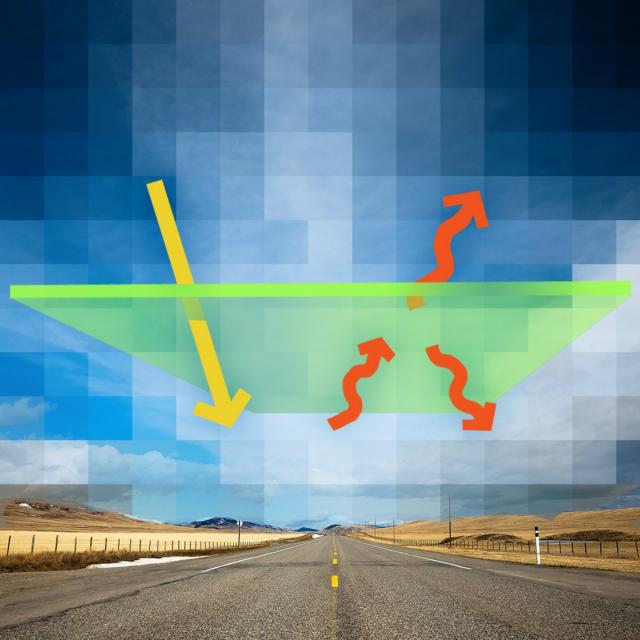
This class provides a series of Python programming exercises intended to explore the use of numerical modeling in the Earth system and climate sciences. The scientific background for these models is presented in a companion class, Global Warming I: The Science and Modeling of Climate Change. This class assumes that you are new to Python programming (and this is indeed a great way to learn Python!), but that you will be able to pick up an elementary knowledge of Python syntax from another class or from on-line tutorials.

Oct 5th 2026
5-12 Weeks
3D Data Visualization for Science Communication (Coursera) Coursera
University of Illinois at Urbana-Champaign

3D Data Visualization for Science Communication (Coursera)

This course is an introduction to 3D scientific data visualization, with an emphasis on science communication and cinematic design for appealing to broad audiences. You will develop visualization literacy, through being able to interpret/analyze (read) visualizations and create (write) your own visualizations.

Oct 5th 2026
4 Weeks
Estruturas de dados Python (Coursera) Coursera
University of Michigan

Estruturas de dados Python (Coursera)

Este curso apresentará as estruturas de dados centrais da linguagem de programação Python. Vamos superar os fundamentos da programação de procedimentos e explorar como podemos usar as estruturas de dados integradas do Python, como listas, dicionários e tuplas, para realizar análises de dados cada vez mais complexas. Este curso cobrirá os capítulos 6 a 10 do livro “Python para Todos”. Este curso aborda o Python 3.

Oct 5th 2026
5-12 Weeks
Applied Plotting, Charting & Data Representation in Python (Coursera) Coursera
University of Michigan

Applied Plotting, Charting & Data Representation in Python (Coursera)

This course will introduce the learner to information visualization basics, with a focus on reporting and charting using the matplotlib library. The course will start with a design and information literacy perspective, touching on what makes a good and bad visualization, and what statistical measures translate into in terms of visualizations. The second week will focus on the technology used to make visualizations in python, matplotlib, and introduce users to best practices when creating basic charts and how to realize design decisions in the framework.

Oct 5th 2026
4 Weeks