Fundamentals of Visualization with Tableau (Coursera)

Fundamentals of Visualization with Tableau (Coursera)

In this first course of the specialization, you will discover just what data visualization is, and how we can use it to better see and understand data. Using Tableau, we’ll examine the fundamental concepts of data visualization and explore the Tableau interface, identifying and applying the various tools Tableau has to offer.

Class Deals by MOOC List - Click here and see Coursera's Active Discounts, Deals, and Promo Codes.

By the end of the course you will be able to prepare and import data into Tableau and explain the relationship between data analytics and data visualization. This course is designed for the learner who has never used Tableau before, or who may need a refresher or want to explore Tableau in more depth. No prior technical or analytical background is required. The course will guide you through the steps necessary to create your first visualization story from the beginning based on data context, setting the stage for you to advance to the next course in the Specialization.

What You Will Learn

  • Install Tableau Public Software and create a visualization
  • Examine and navigate the Tableau Public workspace
  • Practice and connect to different data sources
  • Examine ways to define your project

Course 1 of 5 in the Data Visualization with Tableau Specialization.

Syllabus

WEEK 1
Getting Started & Introduction to Data Visualization
Welcome to this first module, where you will begin to discover the power of data visualization. You will define the meaning and purpose of data visualization and explore the various types of data visualization tools, beyond Tableau. You will install Tableau on your own device and create your first visualization.

WEEK 2
Exploring and Navigating Tableau
With the last module, you were able to create your first visualization through guided practice. The secret to doing visualizations is really knowing the tool you will be using. For this module, you will explore and navigate the Tableau interface and be able to use specific tools as you begin your visualization journey.

WEEK 3
Making Data Connections
Creating visualizations require data and in this module, you will discuss the various data sources for visualization and specifically what can be used in Tableau. You will prepare your data and identify the types of data connections possible with Tableau. You will be able to connect and merge to multiple data sources which can help make your visualizations more powerful.

WEEK 4
Context of Data Visualization & Course Wrap-Up
Data visualization is about telling a story using data. However, before you can be successful at data visualization, you must understand the "who", "what", and "how" of data context. In this final module, you will be able to determine who your audience will be and what your relationship to them is. You will analyze a real world application of data context and be able to write out a visualization story based on data context.

Go to Class
MOOC List is learner-supported. When you buy through links on our site, we may earn an affiliate commission.

Related Courses

Data intelligence for businesses and managers (Coursera) Coursera
Institut Mines-Telecom

Data intelligence for businesses and managers (Coursera)

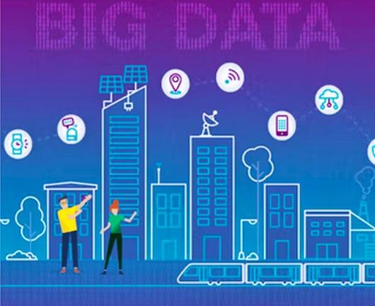
With the proliferation of connected objects (computers, tablets, watches, etc.), huge masses of data are generated every second. This Big Data has led to the emergence of a data economy, where data is the main source of competitive advantage for companies. In this sense, data and its processing tools have become a strategic priority for companies, and the main gas pedal of their digital transformation.

Nov 2nd 2026
5-12 Weeks
Data Visualization with Tableau Project (Coursera) Coursera
University of California, Davis

Data Visualization with Tableau Project (Coursera)

In this project-based course, you will follow your own interests to create a portfolio worthy single-frame viz or multi-frame data story that will be shared on Tableau Public. You will use all the skills taught in this Specialization to complete this project step-by-step, with guidance from your instructors along the way.

Nov 2nd 2026
5-12 Weeks
From Excel to Power BI (Coursera) Coursera
Knowledge Accelerators

From Excel to Power BI (Coursera)

Are you using Excel to manage, analyze, and visualize your data? Would you like to do more? Perhaps you've considered Power BI as an alternative, but have been intimidated by the idea of working in an advanced environment. The fact is, many of the same tools and mechanisms exist across both these Microsoft products. This means Excel users are actually uniquely positioned to transition to data modeling and visualization in Power BI! Using methods that will feel familiar, you can learn to use Power BI to make data-driven business decisions using large volumes of data.

Nov 2nd 2026
1 Week
Interprofessional Healthcare Informatics (Coursera) Coursera
University of Minnesota

Interprofessional Healthcare Informatics (Coursera)

Interprofessional Healthcare Informatics is a graduate-level, hands-on interactive exploration of real informatics tools and techniques offered by the University of Minnesota and the University of Minnesota's National Center for Interprofessional Practice and Education. We will be incorporating technology-enabled educational innovations to bring the subject matter to life. Over the 10 modules, we will create a vital online learning community and a working healthcare informatics network.

Nov 9th 2026
5-12 Weeks
Math for MBA and GMAT Prep (Coursera) Coursera
Emory University

Math for MBA and GMAT Prep (Coursera)

This course gives participants a basic understanding of statistics as they apply in business situations. A fair share of students considering MBA programs come from backgrounds that do not include a large amount of training in mathematics and statistics. Often, students find themselves at a disadvantage when they apply for or enroll in MBA programs. This course will give you the tools to understand how these business statistics are calculated for navigating the built-in formulas that are included in Excel, but also how to apply these formulas in an range of business settings and situations.

Nov 2nd 2026
5-12 Weeks
Dataplex by Google Cloud (Coursera) Coursera
Board Infinity

Dataplex by Google Cloud (Coursera)

Welcome to "Dataplex By Google Cloud " a comprehensive course designed to provide a thorough understanding of Google Cloud Dataplex, a platform for managing, monitoring, and analyzing data across various data systems in Google Cloud. Spanning two modules, the course begins with the fundamentals of Dataplex, including its setup, configuration, and basic functionalities.

Nov 9th 2026
2 Weeks
Visualization for Data Journalism (Coursera) Coursera
University of Illinois at Urbana-Champaign

Visualization for Data Journalism (Coursera)

While telling stories with data has been part of the news practice since its earliest days, it is in the midst of a renaissance. Graphics desks which used to be deemed as “the art department,” a subfield outside the work of newsrooms, are becoming a core part of newsrooms’ operation. Those people (they often have various titles: data journalists, news artists, graphic reporters, developers, etc.) who design news graphics are expected to be full-fledged journalists and work closely with reporters and editors.

Nov 2nd 2026
5-12 Weeks
Business Intelligence Concepts, Tools, and Applications (Coursera) Coursera
University of Colorado System

Business Intelligence Concepts, Tools, and Applications (Coursera)

This is the fourth course in the Data Warehouse for Business Intelligence specialization. Ideally, the courses should be taken in sequence. In this course, you will gain the knowledge and skills for using data warehouses for business intelligence purposes and for working as a business intelligence developer. You’ll have the opportunity to work with large data sets in a data warehouse environment and will learn the use of MicroStrategy's Online Analytical Processing (OLAP) and Visualization capabilities to create visualizations and dashboards.

Oct 26th 2026
5-12 Weeks
Use Tableau for your Data Science Workflow (Coursera) Coursera
Edureka

Use Tableau for your Data Science Workflow (Coursera)

Learn Tableau fundamentals, advanced visualizations, and integration with data science tools. Elevate your skills in creating impactful dashboards. Enroll now for hands-on experience and master the art of data storytelling. Unlock the potential for advanced analytics, exploring correlations and trends within your data. Build interactive dashboards that tell compelling data stories, utilizing filters, parameters, and actions for user engagement.

Nov 2nd 2026
1 Week
Predictive Modeling and Analytics (Coursera) Coursera
University of Colorado Boulder

Predictive Modeling and Analytics (Coursera)

Welcome to the second course in the Data Analytics for Business specialization! This course will introduce you to some of the most widely used predictive modeling techniques and their core principles. By taking this course, you will form a solid foundation of predictive analytics, which refers to tools and techniques for building statistical or machine learning models to make predictions based on data. You will learn how to carry out exploratory data analysis to gain insights and prepare data for predictive modeling, an essential skill valued in the business.

Oct 26th 2026
4 Weeks