Data Visualization with Python (Coursera)

Offered by IBM,
Data Visualization with Python (Coursera)

One of the key skills of a data scientist is the ability to tell a compelling story, visualizing data and findings in an approachable and stimulating way. Learning how to leverage a software tool to visualize data will also enable you to extract information, better understand the data, and make more effective decisions.

Class Deals by MOOC List - Click here and see Coursera's Active Discounts, Deals, and Promo Codes.

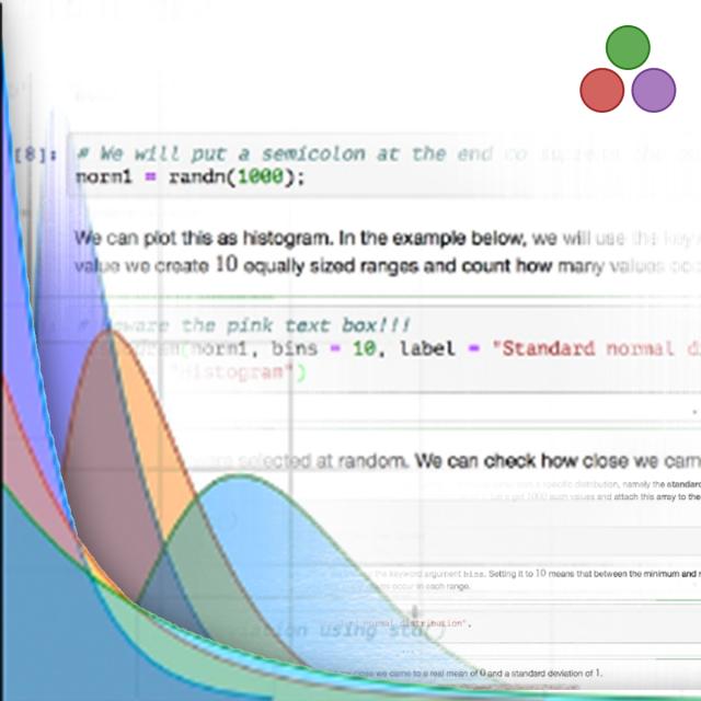
"A picture is worth a thousand words". We are all familiar with this expression. It especially applies when trying to explain the insight obtained from the analysis of increasingly large datasets. Data visualization plays an essential role in the representation of both small and large-scale data.
The main goal of this Data Visualization with Python course is to teach you how to take data that at first glance has little meaning and present that data in a form that makes sense to people. Various techniques have been developed for presenting data visually but in this course, we will be using several data visualization libraries in Python, namely Matplotlib, Seaborn, and Folium.
This course can be applied to multiple Specializations or Professional Certificates programs. Completing this course will count towards your learning in any of the following programs:

Syllabus

WEEK 1
Introduction to Data Visualization Tools
In this module, you will learn about data visualization and some of the best practices to keep in mind when creating plots and visuals. You will also learn about the history and the architecture of Matplotlib and learn about basic plotting with Matplotlib. In addition, you will learn about the dataset on immigration to Canada, which will be used extensively throughout the course. Finally, you will briefly learn how to read csv files into a pandas dataframe and process and manipulate the data in the dataframe, and how to generate line plots using Matplotlib.

WEEK 2
Basic and Specialized Visualization Tools
In this module, you learn about area plots and how to create them with Matplotlib, histograms and how to create them with Matplotlib, bar charts, and how to create them with Matplotlib, pie charts, and how to create them with Matplotlib, box plots and how to create them with Matplotlib, and scatter plots and bubble plots and how to create them with Matplotlib.

WEEK 3
Advanced Visualizations and Geospatial Data
In this module, you will learn about advanced visualization tools such as waffle charts and word clouds and how to create them. You will also learn about seaborn, which is another visualization library, and how to use it to generate attractive regression plots. In addition, you will learn about Folium, which is another visualization library, designed especially for visualizing geospatial data. Finally, you will learn how to use Folium to create maps of different regions of the world and how to superimpose markers on top of a map, and how to create choropleth maps.

WEEK 4
Creating Dashboards with Plotly and Dash
In this module you will get started with dashboard creation using the Plotly library. You will create a dashboard with a theme US Domestic Airline Flights Performance. You will do this using a US airline reporting carrier on-time performance dataset, Plotly, and Dash concepts learned throughout the course. Hands-on labs will follow each concept to make you comfortable with using the library.
Reading lists will reference additional resources to learn more about the concepts covered.

WEEK 5
Final Project

Go to Class
MOOC List is learner-supported. When you buy through links on our site, we may earn an affiliate commission.

Related Courses

HI-FIVE: Health Informatics For Innovation, Value & Enrichment (Administrative/IT Perspective) (Coursera) Coursera
Columbia University

HI-FIVE: Health Informatics For Innovation, Value & Enrichment (Administrative/IT Perspective) (Coursera)

HI-FIVE (Health Informatics For Innovation, Value & Enrichment) Training is an approximately 10-hour online course designed by Columbia University in 2016, with sponsorship from the Office of the National Coordinator for Health Information Technology (ONC). The training is role-based and uses case scenarios. No additional hardware or software are required for this course. Our nation’s healthcare system is changing at a rapid pace.

Aug 3rd 2026
4 Weeks
Gender Foundations in Health Data: A Data for Health Course (Coursera) Coursera
Johns Hopkins University

Gender Foundations in Health Data: A Data for Health Course (Coursera)

Welcome to Gender Foundations in Health Data: A Data for Health course. This course was developed from an online seminar series of the same name, that was hosted by Johns Hopkins University Bloomberg School of Health in 2021-22. The course instructors are Drs. Michelle Kaufman and Tahilin Sanchez Karver. This course will raise learners' awareness of the necessity of utilizing a gender lens in global public health data, policy, and practice, feature how-tos and key examples of integration of gender in data collection, analysis, and use from Data for Health partners.

Aug 3rd 2026
1 Week
Data Processing Using Python (Coursera) Coursera
Nanjing University

Data Processing Using Python (Coursera)

This course is mainly for non-computer majors. It starts with the basic syntax of Python, to how to acquire data in Python locally and from network, to how to present data, then to how to conduct basic and advanced statistic analysis and visualization of data, and finally to how to design a simple GUI to present and process data, advancing level by level.

Aug 10th 2026
5-12 Weeks
Global Statistics - Composite Indices for International Comparisons (Coursera) Coursera
University of Geneva

Global Statistics - Composite Indices for International Comparisons (Coursera)

In this course on global statistics, offered by the University of Geneva jointly with the ETH Zürich KOF, you will learn the general approach of constructing composite indices and some of resulting problems. We will discuss the technical properties, the internal structure (like aggregation, weighting, stability of time series), the primary data used and the variable selection methods. These concepts will be illustrated using a sample of the most popular composite indices. We will try to address not only statistical questions but also focus on the distinction between policy-, media- and paradigm-driven indicators.

Aug 3rd 2026
5-12 Weeks
Understanding China, 1700-2000: A Data Analytic Approach, Part 2 (Coursera) Coursera
The Hong Kong University of Science and Technology - HKUST

Understanding China, 1700-2000: A Data Analytic Approach, Part 2 (Coursera)

The purpose of this course is to summarize new directions in Chinese history and social science produced by the creation and analysis of big historical datasets based on newly opened Chinese archival holdings, and to organize this knowledge in a framework that encourages learning about China in comparative perspective. Our course demonstrates how a new scholarship of discovery is redefining what is singular about modern China and modern Chinese history.

Aug 3rd 2026
4 Weeks
Designing Engaging Dashboards for Healthcare Analytics (Coursera) Coursera
Northeastern University

Designing Engaging Dashboards for Healthcare Analytics (Coursera)

Introduces processes and design principles for creating meaningful displays of information that support effective business decision-making. Studies how to collect and process data; create visualizations (both static and interactive); and use them to provide insight into a problem, situation, or opportunity. Introduces methods to critique visualizations along with ways to answer the elusive question: “What makes a visualization effective?” Discusses the challenges of making data understandable across a wide range of audiences.

Aug 3rd 2026
4 Weeks
Machine Translation (Coursera) Coursera
Karlsruhe Institute of Technology - KIT

Machine Translation (Coursera)

Welcome to the CLICS-Machine Translation MOOC. This MOOC explains the basic principles of machine translation. Machine translation is the task of translating from one natural language to another natural language. Therefore, these algorithms can help people communicate in different languages. Such algorithms are used in common applications, from Google Translate to apps on your mobile device.

Aug 3rd 2026
5-12 Weeks
Statistical Inference and Hypothesis Testing in Data Science Applications (Coursera) Coursera
University of Colorado Boulder

Statistical Inference and Hypothesis Testing in Data Science Applications (Coursera)

This course will focus on theory and implementation of hypothesis testing, especially as it relates to applications in data science. Students will learn to use hypothesis tests to make informed decisions from data. Special attention will be given to the general logic of hypothesis testing, error and error rates, power, simulation, and the correct computation and interpretation of p-values. Attention will also be given to the misuse of testing concepts, especially p-values, and the ethical implications of such misuse.

Aug 10th 2026
5-12 Weeks
Analyzing and Visualizing Data in Looker (Coursera) Coursera
Google Cloud

Analyzing and Visualizing Data in Looker (Coursera)

In this course, you learn how to do the kind of data exploration and analysis in Looker that would formerly be done primarily by SQL developers or analysts. Upon completion of this course, you will be able to leverage Looker's modern analytics platform to find and explore relevant content in your organization’s Looker instance, ask questions of your data, create new metrics as needed, and build and share visualizations and dashboards to facilitate data-driven decision making.

Aug 3rd 2026
2 Weeks
Data Visualization with Python & R for Engineers (Coursera) Coursera
Northeastern University

Data Visualization with Python & R for Engineers (Coursera)

The primary objective of this course is to offer students an opportunity to learn how to use visualization tools and techniques for data exploration, knowledge discovery, data storytelling, and decision making in engineering, healthcare operations, manufacturing, and related applications. This course covers basics of data mining and visualization, and Python. It also introduces students to static visualization charts and techniques that reveal information, patterns, interactions.

Aug 3rd 2026
4 Weeks
Programación en Python (Coursera) Coursera
Universidad de los Andes

Programación en Python (Coursera)

¡Te damos la bienvenida al curso de Programación en Python de la Universidad de los Andes! El propósito de este curso es ofrecerte un ambiente interactivo para que desarrolles tus habilidades de pensamiento computacional, aprendas a programar en el lenguaje Python y te entrenes en la resolución de problemas utilizando un computador. La estrategia pedagógica empleada es el aprendizaje activo basado en casos.

Aug 3rd 2026
4 Weeks
Bioinformatic Methods I (Coursera) Coursera
University of Toronto

Bioinformatic Methods I (Coursera)

Large-scale biology projects such as the sequencing of the human genome and gene expression surveys using RNA-seq, microarrays and other technologies have created a wealth of data for biologists. However, the challenge facing scientists is analyzing and even accessing these data to extract useful information pertaining to the system being studied. This course focuses on employing existing bioinformatic resources – mainly web-based programs and databases – to access the wealth of data to answer questions relevant to the average biologist, and is highly hands-on.

Jul 27th 2026
5-12 Weeks