Statistical analysis is an indispensable aspect of data analysis because it allows us to collect, review and analyse data to draw valuable conclusions in various industries. This is why the market for statisticians is projected to grow in the future. If you want to build your statistics and probability expertise and learn about data visualisation, this short course is a great introduction to statistics as the art of learning from data.
Class Deals by MOOC List - Click here and see Coursera's Active Discounts, Deals, and Promo Codes.
With real-life examples, you will explore the differences between data and information to discover the need for statistical models to gain objective and reliable inferences. You will consider what "unbiased" data collection means and explore various examples of data misrepresentation, misconception or incompleteness which will help you to develop statistical intuition and good practice skills.
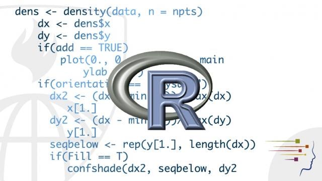
Data visualisation is a sought-after skill. To create graphical and numerical summaries, you’ll learn and practice R software skills working in RStudio for exploratory data analysis. You will develop an intuitive concept of probability by completing probability experiments and computer simulations of binomial trails e.g., tossing a coin or rolling a die.
By the end of the course, you will be able to understand the role of statistical models in data analysis, develop numerical and graphical summaries using RStudio, and perform probability experiments in computer simulations.
No matter your current mathematics skill level, you will find something of interest in the course that offers many practical and real-life examples of statistics in action.
This course is a taster of the Online MSc in Data Science (Statistics) and it can also be completed by learners who want to understand the fundamentals of exploratory data analysis and data visualisation.
What you'll learn
- Explain the different data types and apply data preparation methods to clean data.
- Explore ways to visualise data using the software R.
- Understand how visualisation of data can inform statistical model selection.
Syllabus
Getting to know your data for graphical summaries
This first week introduces you to data types (categorical, discrete, and continuous) and representing data via graphical summaries (or data visualisation). You will go through the steps you need to take to prepare data for analysis and data cleaning, by identifying missing data and outliers. You learn about and practice common graphical summaries such as box plots, histograms, and kernel density estimation (KDE).
Apply your knowledge: graphical summaries
This second week gives you the opportunity to apply your knowledge of graphical summaries from Week 1 in greater depth, with tasks in RStudio to complete such as preparing data for analysis and data cleaning, by identifying missing data and outliers.
Apply your knowledge: make your own graphical summaries and peer review
In this final week, you have the opportunity to build on your experiences of RStudio and data analysis using graphical summaries in Week 2. In Week 3, you complete a substantive task in RStudio to complete and there is a graded peer review where you share your output from the RStudio lab with a fellow student.