Data Visualization and Communication with Tableau (Coursera)

Offered by Duke University,
Data Visualization and Communication with Tableau (Coursera)

One of the skills that characterizes great business data analysts is the ability to communicate practical implications of quantitative analyses to any kind of audience member. Even the most sophisticated statistical analyses are not useful to a business if they do not lead to actionable advice, or if the answers to those business questions are not conveyed in a way that non-technical people can understand. In this course you will learn how to become a master at communicating business-relevant implications of data analyses.

Class Deals by MOOC List - Click here and see Coursera's Active Discounts, Deals, and Promo Codes.

By the end, you will know how to structure your data analysis projects to ensure the fruits of your hard labor yield results for your stakeholders. You will also know how to streamline your analyses and highlight their implications efficiently using visualizations in Tableau, the most popular visualization program in the business world. Using other Tableau features, you will be able to make effective visualizations that harness the human brain’s innate perceptual and cognitive tendencies to convey conclusions directly and clearly. Finally, you will be practiced in designing and persuasively presenting business “data stories” that use these visualizations, capitalizing on business-tested methods and design principles.
Course 3 of 5 in the Excel to MySQL: Analytic Techniques for Business Specialization.

Syllabus

WEEK 1
Asking The "Right Questions"
Welcome! This week, you will learn how data analysts ask the right questions to ensure project success. By the end of this week, you will be able to: Craft the right questions to ensure your analysis projects succeed Leverage questions to design logical and structured analysis plans Remember to refer back to the Additional Resources reading: Identifying and Eliciting Information from Stakeholders). In addition, you will complete a graded quiz. As always, if you have any questions, post them to the Discussions.

WEEK 2
Data Visualization with Tableau
Welcome to week 2! This week you'll install Tableau to learn how visualizing data helps you figure out what your data mean efficiently, and in the process of doing so, helps you narrow in on what factors you should take into consideration in your statistical models or predictive algorithms. Over the next two weeks, we’re going to learn how to use Tableau to implement this type of visualization and to help you find, and communicate, answers to business questions, as well as work with the Tableau functions that all data analysts should be familiar with.. In addition, through a series of practice exercises, you will use a data set to do example analyses and to answer specific sample questions about salaries for certain data-related jobs across the United State. Then for graded exercises, you will use a different data set to work out analyses and questions that will require you to directly apply the Tableau skills you have acquired through practice. By the end of this week, you will be able to: Create the most important graphs used in business analysis and transform data in Tableau Once you have watched the "Why Tableau" video, and installed the software, remember to refer back to the Salary Data Set and to the Dognition Data Set resources posted on the course site this week. You will also complete a graded quiz at the end of the week. As always, if you have any questions, post them to the Discussions.

WEEK 3
Dynamic Data Manipulation and Presentation in Tableau
Welcome to week 3! This week you'll continue learning how to use Tableau to answer data analysis questions. You will learn how to use Tableau to both find, and eventually communicate answers to business questions. You'll learn about the process of elicitation, and learn how to ensure your data story is not undermined by overgeneralization or bias and how to format your data charts to begin creating a compelling data story. By the end of this week, you will be able to: Write calculations and equations in Tableau Publish online business dashboards with Tableau. Remember to refer to the additional resources for this week: “Examples of Tableau Dashboards and Stories” and "Using Tableau Dashboards When You Don't Have To." You will also complete a graded quiz. As always, if you have any questions, post them to the Discussions.

WEEK 4
Your Communication Toolbox: Visualizations, Logic, and Stories
Welcome to week 4! This week you will become a master at getting people to agree with your data-driven business recommendations as you learn to deliver a compelling business presentation. You’ll learn about the insight from the intersection of visualization science and decision science, and what this means for you as a data analyst, who seeks to design a compelling and effective business presentations. If you intend to affect people’s decisions, you need to influence where they look. This week we will review a set of tools and concepts you can use to optimize your visualizations and your presentation style. You will soon be a master at getting people to agree with your data-driven business recommendations! By the end of this week, you will be able to: Tell stories with data Design effective slide presentations to showcase your data story, and Deliver compelling business presentations Remember to refer back to the Study Guide: Designing and Delivering Effective Presentations. You will also complete a graded quiz. As always, if you have any questions, post them to the Discussions.

WEEK 5
Final Project
Welcome to week 5! This week you will complete your final project. This assignment requires you to submit a recording of yourself giving a 4-5 minute presentation in which you present a data-driven business process change proposal to Dognition company management about how to increase the numbers of tests users complete. Students will give a short, peer-reviewed business presentation that uses a specified chart in Tableau. The final project will assess your mastery of the following: Demonstrated understanding the Tableau functions discussed in this course Adapting visualizations to make them maximally communicative Storyboarding skills Translating your story into a presentation ready for the boardroom Effective presentation delivery Evaluating business presentations Remember to refer to the Background Information for Peer Review Assignment on the course web site before you begin. This final course project is a comprehensive assessment covering all of the course material and will take approximately 6-8 hours to complete. As always, if you have any questions, post them to the Discussions. Thank you for your contributions to this final project!

Go to Class
MOOC List is learner-supported. When you buy through links on our site, we may earn an affiliate commission.

Related Courses

Habilidades de Excel para negócios: Fundamentos (Coursera) Coursera
Macquarie University

Habilidades de Excel para negócios: Fundamentos (Coursera)

Neste primeiro curso da especialização Habilidades de Excel para negócios, você aprenderá os fundamentos do Microsoft Excel. Dentro de seis semanas, você poderá navegar habilmente pela interface de usuário do Excel, realizar cálculos básicos com fórmulas e funções, formatar planilhas profissionalmente e criar visualizações de dados por meio de gráficos e tabelas.

Oct 5th 2026
5-12 Weeks
Cómo inspirar y a motivar personas (Coursera) Coursera
University of Michigan

Cómo inspirar y a motivar personas (Coursera)

En este curso, aprenderá a crear una visión compartida para su equipo y a comunicarla con eficacia a sus compañeros. También aprenderá a fijar metas y expectativas eficaces de un modo que le permita a su equipo alcanzar esa visión compartida. Por último, comprenderá las necesidades y los factores de desempeño más importantes en todas las culturas y aprenderá a alinear incentivos con conductas deseadas, para motivar a sus compañeros a alcanzar los objetivos del equipo.

Oct 5th 2026
4 Weeks
Data science perspectives on pandemic management (Coursera) Coursera
Politecnico di Milano

Data science perspectives on pandemic management (Coursera)

The COVID-19 pandemic is one of the first world-wide scenarios where data made a difference in capturing and analyzing the diffusion and impact of the disease. We offer an introductory course for decision makers, policy makers, public bodies, NGOs, and private organizations about methods, tools, and experiences on the use of data for managing current and future pandemic scenarios.

Oct 5th 2026
5-12 Weeks
Healthcare Information Design and Visualizations (Coursera) Coursera
Northeastern University

Healthcare Information Design and Visualizations (Coursera)

Introduces processes and design principles for creating meaningful displays of information that support effective business decision-making. Studies how to collect and process data; create visualizations (both static and interactive); and use them to provide insight into a problem, situation, or opportunity. Introduces methods to critique visualizations along with ways to answer the elusive question: “What makes a visualization effective?”

Oct 5th 2026
4 Weeks
Gestão de Marca & Crise de Imagem (Coursera) Coursera
FIA Business School

Gestão de Marca & Crise de Imagem (Coursera)

No mundo contemporâneo, "marca" é um dos ativos mais valorizados pelos mercados. Contudo, com o empoderamento da sociedade, as marcas ficaram mais frágeis e mais expostas. Nesse cenário, estar preparado para a gestão de crise de marca pode fazer a diferença entre a sobrevivência e a morte do negócio. Ao final deste curso, você será capaz de entender e relacionar os principais conceitos de marca, de sistema de informação de marketing e de gestão de crise de marketing.

Oct 5th 2026
5-12 Weeks
Excel/VBA for Creative Problem Solving, Part 2 (Coursera) Coursera
University of Colorado Boulder

Excel/VBA for Creative Problem Solving, Part 2 (Coursera)

Excel/VBA for Creative Problem Solving, Part 2" builds off of knowledge and skills obtained in "Excel/VBA for Creative Problem Solving, Part 1" and is aimed at learners who are seeking to augment, expand, optimize, and increase the efficiency of their Excel spreadsheet skills by tapping into the powerful programming, automation, and customization capabilities available with Visual Basic for Applications (VBA).

Oct 5th 2026
4 Weeks
Applied Public History: Places, People, Stories (Coursera) Coursera
University of London

Applied Public History: Places, People, Stories (Coursera)

This course introduces learners to applied public history: understanding and interpreting the past today, and engaging diverse communities in the practice of making and sharing histories. The course draws on project case studies, expert insights and diverse perspectives to model exciting approaches to researching and sharing the history of places and people. Learners will develop a toolkit to apply in their own practice, by participating in discussion, quizzes, creative activities and mini masterclasses. What kinds of stories can we discover through research into the history of places and people?

Oct 5th 2026
5-12 Weeks
Practical Time Series Analysis (Coursera) Coursera
The State University of New York

Practical Time Series Analysis (Coursera)

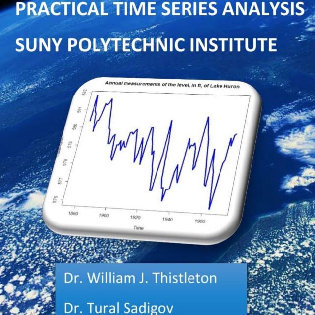
Many of us are "accidental" data analysts. We trained in the sciences, business, or engineering and then found ourselves confronted with data for which we have no formal analytic training. This course is designed for people with some technical competencies who would like more than a "cookbook" approach, but who still need to concentrate on the routine sorts of presentation and analysis that deepen the understanding of our professional topics.

Oct 5th 2026
5-12 Weeks
Introduction to Accounting Data Analytics and Visualization (Coursera) Coursera
University of Illinois at Urbana-Champaign

Introduction to Accounting Data Analytics and Visualization (Coursera)

Accounting has always been about analytical thinking. From the earliest days of the profession, Luca Pacioli emphasized the importance of math and order for analyzing business transactions. The skillset that accountants have needed to perform math and to keep order has evolved from pencil and paper, to typewriters and calculators, then to spreadsheets and accounting software. A new skillset that is becoming more important for nearly every aspect of business is that of big data analytics: analyzing large amounts of data to find actionable insights. This course is designed to help accounting students develop an analytical mindset and prepare them to use data analytic programming languages like Python and R.

Oct 5th 2026
5-12 Weeks
Population Health: Responsible Data Analysis (Coursera) Coursera
Leiden University

Population Health: Responsible Data Analysis (Coursera)

In most areas of health, data is being used to make important decisions. As a health population manager, you will have the opportunity to use data to answer interesting questions. In this course, we will discuss data analysis from a responsible perspective, which will help you to extract useful information from data and enlarge your knowledge about specific aspects of interest of the population.

Oct 5th 2026
4 Weeks
Foundational Skills for Communicating About Health (Coursera) Coursera
University of Michigan

Foundational Skills for Communicating About Health (Coursera)

Effective communication is a core skill that nearly every health professional will need and use during their careers. Yet, few health professionals receive even basic training in how to design communications to be clear and successful. As “foundational skills,” the content in this course can be applied to both oral and written communication, within and beyond health.

Oct 5th 2026
5-12 Weeks