Advanced Data Analysis and Collaboration in Qlik Sense (Coursera)

Advanced Data Analysis and Collaboration in Qlik Sense (Coursera)

This course is an advanced level course designed for learners who want to use Qlik Sense to perform sophisticated data analytics, build dashboards, and communicate full reports and stories from their data. These advanced concepts include more than just visualization features such as dynamic filtering and conditional formatting, but more so data functionality such as advanced expressions, drill-downs, leads, lags, and more. This is important as these skills are directly required when creating sophisticated business analyses and dashboards.

Class Deals by MOOC List - Click here and see Coursera's Active Discounts, Deals, and Promo Codes.

This course demonstrates the advanced functionalities of Qlik Sense. The course starts with advanced data analysis techniques, including both strict analysis like calculated fields, set analysis, etc. It then goes through advanced visualization and dashboard functionality, like dynamic filters, drill-downs, lags, leads, and more. Finally, the course demonstrates how to collaborate with other people, through sharing, bookmarking, and embedding dashboards and reports.
"Advanced Data Analysis and Collaboration with Qlik Sense" is the third and final course in our series, building upon the foundations laid in "Data Ingestion, Exploration, and Visualization with Qlik Sense" and "Introduction to Data Visualization with Qlik Sense." Together, these courses provide a comprehensive skill set for leveraging Qlik Sense as a powerful tool for data analytics, empowering you to analyze data effectively, create impactful visualizations, and generate valuable insights for a wide range of business purposes, from performance tracking to decision-making and beyond.
This program is designed for anyone interested in mastering advanced data analytics and visualization concepts with Qlik Sense. These include data and business analysts who regularly analyze and communicate with data.
To excel in "Advanced Data Analysis and Collaboration with Qlik Sense," learners should have a solid grasp of Qlik Sense, including basic data analysis concepts and intermediate-level data visualization skills. Proficiency in using Qlik Sense's interface, creating fundamental visualizations, and working with data is essential. Additionally, learners should possess a foundational understanding of data analysis principles such as aggregations and filtering. Familiarity with basic scripting within Qlik Sense, including data loading and transformation, will be advantageous, as more advanced scripting techniques are introduced.

What you'll learn

  • Explore advanced data analysis techniques in Qlik Sense, such as set analysis, calculated fields, and advanced expressions.
  • Utilize advanced dashboard features: conditional formatting, time lag, rolling sums, dynamic filters, and drilldowns, with practical applications.
  • Demonstrate collaboration features, such as creating and sharing bookmarks, stories, and reports

Syllabus

Advanced Data Analysis and Collaboration with Qlik Sense
This is an advanced-level course designed for learners who want to use Qlik Sense to perform sophisticated data analytics, build dashboards, and communicate full reports and stories from their data. These advanced concepts include more than just visualization features such as dynamic filtering and conditional formatting, and data functionality such as advanced expressions, drill-downs, leads, lags, and more. This is important as these skills are required when creating sophisticated business analyses and dashboards
Go to Class
MOOC List is learner-supported. When you buy through links on our site, we may earn an affiliate commission.

Related Courses

Practical Time Series Analysis (Coursera) Coursera
The State University of New York

Practical Time Series Analysis (Coursera)

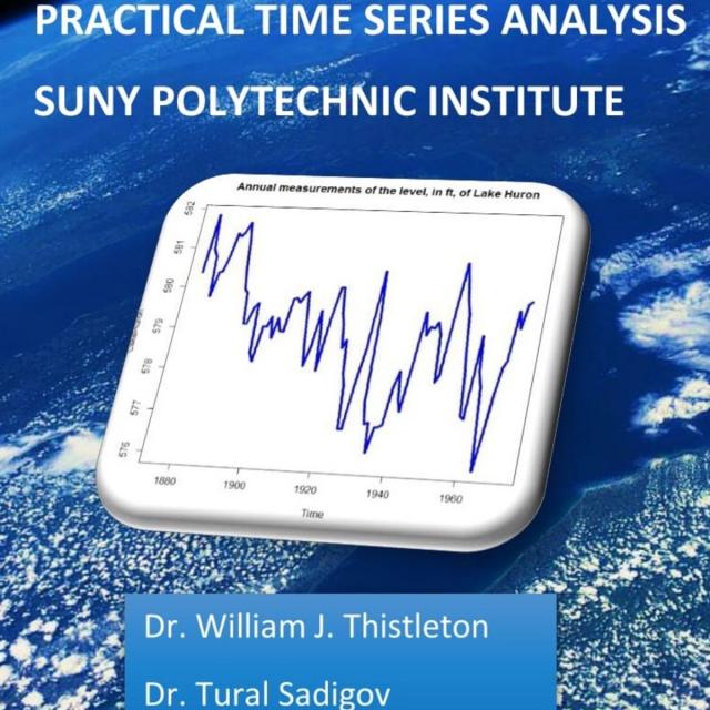
Many of us are "accidental" data analysts. We trained in the sciences, business, or engineering and then found ourselves confronted with data for which we have no formal analytic training. This course is designed for people with some technical competencies who would like more than a "cookbook" approach, but who still need to concentrate on the routine sorts of presentation and analysis that deepen the understanding of our professional topics.

Oct 5th 2026
5-12 Weeks
3D Data Visualization for Science Communication (Coursera) Coursera
University of Illinois at Urbana-Champaign

3D Data Visualization for Science Communication (Coursera)

This course is an introduction to 3D scientific data visualization, with an emphasis on science communication and cinematic design for appealing to broad audiences. You will develop visualization literacy, through being able to interpret/analyze (read) visualizations and create (write) your own visualizations.

Oct 5th 2026
4 Weeks
Gender Foundations in Health Data: A Data for Health Course (Coursera) Coursera
Johns Hopkins University

Gender Foundations in Health Data: A Data for Health Course (Coursera)

Welcome to Gender Foundations in Health Data: A Data for Health course. This course was developed from an online seminar series of the same name, that was hosted by Johns Hopkins University Bloomberg School of Health in 2021-22. The course instructors are Drs. Michelle Kaufman and Tahilin Sanchez Karver. This course will raise learners' awareness of the necessity of utilizing a gender lens in global public health data, policy, and practice, feature how-tos and key examples of integration of gender in data collection, analysis, and use from Data for Health partners.

Sep 28th 2026
1 Week
Data science perspectives on pandemic management (Coursera) Coursera
Politecnico di Milano

Data science perspectives on pandemic management (Coursera)

The COVID-19 pandemic is one of the first world-wide scenarios where data made a difference in capturing and analyzing the diffusion and impact of the disease. We offer an introductory course for decision makers, policy makers, public bodies, NGOs, and private organizations about methods, tools, and experiences on the use of data for managing current and future pandemic scenarios.

Oct 5th 2026
5-12 Weeks
Visualization for Data Journalism (Coursera) Coursera
University of Illinois at Urbana-Champaign

Visualization for Data Journalism (Coursera)

While telling stories with data has been part of the news practice since its earliest days, it is in the midst of a renaissance. Graphics desks which used to be deemed as “the art department,” a subfield outside the work of newsrooms, are becoming a core part of newsrooms’ operation. Those people (they often have various titles: data journalists, news artists, graphic reporters, developers, etc.) who design news graphics are expected to be full-fledged journalists and work closely with reporters and editors.

Oct 5th 2026
5-12 Weeks
Healthcare Information Design and Visualizations (Coursera) Coursera
Northeastern University

Healthcare Information Design and Visualizations (Coursera)

Introduces processes and design principles for creating meaningful displays of information that support effective business decision-making. Studies how to collect and process data; create visualizations (both static and interactive); and use them to provide insight into a problem, situation, or opportunity. Introduces methods to critique visualizations along with ways to answer the elusive question: “What makes a visualization effective?”

Oct 5th 2026
4 Weeks
Applied Plotting, Charting & Data Representation in Python (Coursera) Coursera
University of Michigan

Applied Plotting, Charting & Data Representation in Python (Coursera)

This course will introduce the learner to information visualization basics, with a focus on reporting and charting using the matplotlib library. The course will start with a design and information literacy perspective, touching on what makes a good and bad visualization, and what statistical measures translate into in terms of visualizations. The second week will focus on the technology used to make visualizations in python, matplotlib, and introduce users to best practices when creating basic charts and how to realize design decisions in the framework.

Oct 5th 2026
4 Weeks
Managing Employee Performance (Coursera) Coursera
Starweaver

Managing Employee Performance (Coursera)

In today's dynamic business environment, effective performance management is a crucial skill that sets exceptional leaders apart. This course is designed to equip managers with the principles and techniques required to manage employee performance successfully. Learners will gain a comprehensive understanding of performance management, including setting clear expectations, providing regular feedback, and conducting performance evaluations.

Sep 28th 2026
1 Week
Data Visualization with Tableau Project (Coursera) Coursera
University of California, Davis

Data Visualization with Tableau Project (Coursera)

In this project-based course, you will follow your own interests to create a portfolio worthy single-frame viz or multi-frame data story that will be shared on Tableau Public. You will use all the skills taught in this Specialization to complete this project step-by-step, with guidance from your instructors along the way.

Oct 5th 2026
5-12 Weeks
Functional Programming in Scala Capstone (Coursera) Coursera
École Polytechnique Fédérale de Lausanne

Functional Programming in Scala Capstone (Coursera)

In the final capstone project you will apply the skills you learned by building a large data-intensive application using real-world data. You will implement a complete application processing several gigabytes of data. This application will show interactive visualizations of the evolution of temperatures over time all over the world.

Oct 5th 2026
5-12 Weeks