Build the fundamental knowledge necessary to use Excel and IBM Cognos Analytics to create data visualizations and to create dashboards containing those visualizations to help tell a lucid story about data. This course provides students with the basics required to create data visualizations and dashboards using both Microsoft Excel and IBM Cognos Analytics.
Class Deals by MOOC List - Click here and see EdX's Active Discounts, Deals, and Promo Codes.
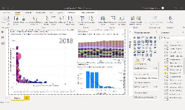
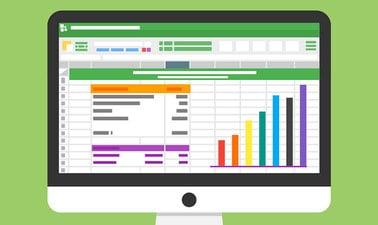
You begin the process of telling a story about your data by creating several basic and advanced charts in Excel and learning how to add them to a digital dashboard. You then become familiar with IBM Cognos Analytics - a popular tool for data visualization and analytics – and learn how to use it to create interactive and informative dashboards. By completing this course, you will gain a basic understanding of using spreadsheets as a tool for data visualization. You will also gain the ability to create effective data visualizations, such as charts or graphs, and you will start to see how they can play a key role in the communication of your data analysis findings to interested parties. All of this can be accomplished without the need to write any code. By the end of this course you will be able to describe common dashboarding tools used by a data analyst, design and create a dashboard in a cloud platform, and begin to raise your level of confidence when creating intermediate level data visualizations.
The emphasis is on applied learning and hands-on practice in this course, and with each hands-on lab, you will gain further experience in the creation of basic and advanced charts and the creation of digital dashboards using both Excel and Cognos Analytics. The final assignment project will allow you to apply these newly acquired skills to create and use data visualizations and add them to a digital dashboard to fulfil a business scenario.
This course makes it simple to get started using Excel and Cognos Analytics to create data visualizations and dashboards to help tell a story about your data, and it does not require any previous data analysis or computer science experience. The course also does not require you to perform any software downloads or installations. All that is required is basic computer literacy, high-school level math, a device with a modern web browser, and the ability to use (or create) a Microsoft account to access Excel online at no-cost, and a basic understanding of Excel spreadsheets. Although the Excel hands-on labs steps are specifically related to using ‘Excel for the web’, if you already have the full desktop version of Excel, you should be able to use that to follow along quite easily with the labs.
This course is part of the following programs:
- Data Analyst Professional Certificate
- Data Analysis and Visualization Fundamentals Professional Certificate
- Data Analytics and Visualization with Excel and R Professional Certificate.
What you'll learn
- Basic Excel features to create charts and pivot charts
- The important role charts play in telling a data-driven story
- About creating advanced charts and visualizations
- About the basics of dashboarding
- How to create a simple dashboard using a spreadsheet
- How to register for a trial of Cognos Analytics
- How to create visualizations in Cognos Analytics
- How to build a simple dashboard, and discover advanced features