EdX

Power BI para los negocios, herramientas de productividad (edX)

Power BI para los negocios, herramientas de productividad (edX)

Aprende a utilizar las visualizaciones avanzadas, a personalizar los formatos de informe y a usar las opciones de trabajo colaborativo en Power BI.

Class Deals by MOOC List - Click here and see EdX's Active Discounts, Deals, and Promo Codes.

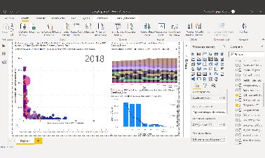
Este es el segundo curso de una serie sobre Power BI, es un curso de nivel intermedio en el que ampliarás conocimientos sobre las medidas DAX para poder generar funciones complejas que midan exactamente lo que quieres y utilizar la inteligencia de tiempo para comparar datos de periodos distintos, conocerás y aprenderás a utilizar las visualizaciones avanzadas como el gráfico de dispersión o las visualizaciones que incorporan inteligencia artificial y aprenderás a personalizar el formato de un informe con los temas de Power BI.
También te contaremos a fondo el servicio en la nube de Power BI, que es de pago si se quieren utilizar las opciones de trabajo en grupo, pero que tiene un precio muy razonable para las posibilidades de colaboración que ofrece. Aprenderás a compartir informes (reports) y conjuntos de datos (datasets) y a crear paneles (dashboards) a partir del contenido de tus informes y el que hayan compartido contigo otros compañeros. Te mostraremos las opciones de trabajo colaborativo y cómo configurar el servicio en la nube para sacarle el máximo rendimiento.
This course is part of the Power Bi para los negocios Professional Certificate.

Prerequisites:
Para seguir este curso es recomendable manejar Power BI a un nivel intermedio, siendo capaz de importar datos con Power Query, incorporar columnas y medidas sencillas en el modelo de datos y manejar las visualizaciones básicas. El curso parte de los contenidos explicados en el primer curso de la serie, Introducción a Power BI para los negocios.

What you'll learn
En este curso aprenderás

  • A utilizar las funciones DAX de agregación, la función DAX calculate para hacer medidas complejas y a utilizar las funciones de inteligencia de tiempo
  • Cuáles son las visualizaciones avanzadas que ofrece Power BI, trabajando con ejemplos visualizaciones como la de embudo, cascada, árbol, dispersión o las que incorporan inteligencia artificial
  • Las opciones avanzadas de configuración y personalización como los temas
  • Cómo funciona el servicio de Power BI en la nube, cuáles son sus componentes, cómo usarlos y cómo configurarlos
  • Cómo utilizar las funciones de colaboración del servicio en la nube para sacarle el máximo partido

Syllabus

Módulo 1: Funciones y medidas DAX en el modelo de datos
Módulo 2: Visualizaciones avanzada de datos
Módulo 3: Segmentación de datos y opciones de configuración adicional
Módulo 4: El servicio en la nube
Módulo 5: Configuración y opciones de trabajo colaborativo


Go to Class
MOOC List is learner-supported. When you buy through links on our site, we may earn an affiliate commission.

Related Courses

Introduction to ChatGPT. Boost your productivity to the maximum using artificial intelligence! (edX) EdX
Universitat Politècnica de València,UPValenciaX

Introduction to ChatGPT. Boost your productivity to the maximum using artificial intelligence! (edX)

Have you heard about ChatGPT and want to learn how to use it to increase your productivity at work radically? Then, this is the course for you. Here, you will learn about its advantages and disadvantages, and different ways to create effective prompts. You will also see examples of its use in tasks as diverse as drafting an instance to a City Council, summarizing a document, enhancing your writing for emails, translating documents, or using it to create Excel formulas and macros.

Self Paced
Self-Paced
Analyzing and Visualizing Data with Power BI (edX) EdX
Davidson College,DavidsonX

Analyzing and Visualizing Data with Power BI (edX)

Step up your analytics game and learn one of the most in-demand job skills in the United States. Power BI is a robust business analytics and visualization tool from Microsoft that helps data professionals bring their data to life and tell more meaningful stores. This four-week course is a beginner's guide to working with data in Power BI and is perfect for professionals. You'll become confident in working with data, creating data visualizations, and preparing reports and dashboards.

Self Paced
Self-Paced
Digital Wellbeing and Productivity (edX) EdX
Jesus College, University of Cambridge

Digital Wellbeing and Productivity (edX)

Individuals and organisations now face the challenge of finding a healthy balance between productivity and downtime. How can we adapt to changes in our digital lives, while remaining healthy and happy? What habits can help us get the most out of our time and energy online? How can we best manage digital wellbeing while maintaining productive digital habits? And how can individuals, teams, businesses, and institutions learn from research-based knowledge to create digital habits and skills to help us flourish together?

Self Paced
Self-Paced
Strategic Communication for Sustainability Leaders (edX) EdX
University System of Maryland - USM,USMx,University of Maryland Center for Environmental Science - UMCES,UMCES

Strategic Communication for Sustainability Leaders (edX)

Communicating science effectively is a critical skill for anyone involved in environmental policy or sustainability. Learn how to integrate effective visualizations into compelling narratives to clearly explain complex ecosystem processes.

Self Paced
Self-Paced
Visualizing Data with Python (edX) EdX
IBM

Visualizing Data with Python (edX)

Data visualization is the graphical representation of data in order to interactively and efficiently convey insights to clients, customers, and stakeholders in general. "A picture is worth a thousand words." We are all familiar with this expression. It especially applies when trying to explain the insights obtained from the analysis of increasingly large datasets. Data visualization plays an essential role in the representation of both small and large-scale data. One of the key skills of a data scientist is the ability to tell a compelling story, visualizing data and findings in an approachable and stimulating way.

Self Paced
Self-Paced
Visualizing Data with R (edX) EdX
IBM

Visualizing Data with R (edX)

Learn about the ggplot2 data visualization package for R, creating map plots with geolocation data using Leaflet, and interactive dashboards to display your work on the web using the R Shiny package! In this course, you will learn about the Grammar of Graphics, a system for describing and building graphs, and how the ggplot2 data visualization package for R applies this concept to basic bar charts, histograms, pie charts, scatter plots, line plots, and box plots.

Self Paced
Self-Paced
Cloud Computing for Enterprises (edX) EdX
University System of Maryland - USM,USMx,University of Maryland Global Campus - UMGC,UMGC

Cloud Computing for Enterprises (edX)

Understand cloud computing technologies and how they can increase business productivity and effectiveness. Organizations are increasingly moving their critical information and assets to the cloud. Understand the technology, best practices, and economics of cloud computing, and the rewards and risks of this rush to the cloud.

Mar 21st 2024
5-12 Weeks
Stakeholder Outreach: Effective Communication of Complex Environmental Threats (edX) EdX
University of Maryland, College Park,University System of Maryland - USM,USMx,UMD,University of Maryland Center for Environmental Science - UMCES,UMCES

Stakeholder Outreach: Effective Communication of Complex Environmental Threats (edX)

Learn how to engage communities through powerful storytelling, data visualization, and persuasive presence to motivate action on complex environmental projects. In this course you’ll learn how to improve your project management communication in your work environment and motivate and engage communities with clear communication to address complex environmental problems.

Self Paced
Self-Paced
Data Science: Capstone (edX) EdX
HarvardX,Harvard University

Data Science: Capstone (edX)

Show what you’ve learned from the Professional Certificate Program in Data Science. To become an expert data scientist you need practice and experience. By completing this capstone project you will get an opportunity to apply the knowledge and skills in R data analysis that you have gained throughout the series. This final project will test your skills in data visualization, probability, inference and modeling, data wrangling, data organization, regression, and machine learning.

Self Paced
Self-Paced