Dashboarding and Deployment (Coursera)

Dashboarding and Deployment (Coursera)

This course will take you through the various parts of analytical dashboarding: from best practices for designing a dashboard, creating a unified analytical environment, to deploying and publishing visualizations. We will briefly discuss the advanced visualization techniques and you will develop an information layout of the biggest gainers and losers in the financial markets and compare those movements to the economic data as your capstone project.

Class Deals by MOOC List - Click here and see Coursera's Active Discounts, Deals, and Promo Codes.

Course 3 of 3 in the Use Tableau for Your Data Science Workflow Specialization.

Syllabus

WEEK 1
From Data to Visual Understanding
Now that you know the primary visualization methods and how to address the action and interaction patterns necessary for visual analytics, it’s time to put it all together. What are the principles of good dashboard design and how do you determine the most effective dashboard to communicate your story? In this module, we’ll take a look at the considerations and processes for creating an analytical dashboard.

WEEK 2
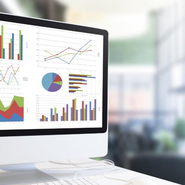
Analytical Dashboarding
After the target audience, objectives, and principles have been clearly defined, creating the dashboard itself is less of a technical exercise and more of a design challenge. This module brings all these elements together into a unified analytical environment. You’ll begin to put everything together in Tableau and design your dashboard.

WEEK 3
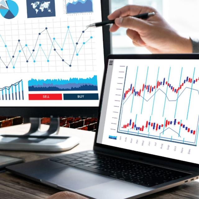
Deploying and Publishing
In the past, deploying and publishing visual analytics was challenging for many organizations. The underlying data management and engineering pipelines were much less capable than today’s backend systems. In this module, we’ll investigate what to do as new analytical platforms enter the market and mature over time, how to stand out as a data visualization expert, and discuss considerations for creating custom visualizations.

WEEK 4
Going Beyond
Consider what you’ve learned so far in this specialization. How might you use geospatial analysis or network analysis in your data science workflow? In addition, how might you design visuals to explain how data has changed over time? In this module, we’ll briefly discuss advanced features that can be used to answer these questions in Tableau. As you reflect on the course content, you will also finalize your capstone project, making use of storytelling principles and best practices for focusing and decluttering, and develop an information layout.

Go to Class
MOOC List is learner-supported. When you buy through links on our site, we may earn an affiliate commission.

Related Courses

Advanced Deployment Scenarios with TensorFlow (Coursera) Coursera
DeepLearning.AI

Advanced Deployment Scenarios with TensorFlow (Coursera)

Bringing a machine learning model into the real world involves a lot more than just modeling. This Specialization will teach you how to navigate various deployment scenarios and use data more effectively to train your model. In this final course, you’ll explore four different scenarios you’ll encounter when deploying models.

Jun 15th 2026
4 Weeks
Data Analysis and Visualization (Coursera) Coursera
University at Buffalo,The State University of New York

Data Analysis and Visualization (Coursera)

By the end of this course, learners are provided a high-level overview of data analysis and visualization tools, and are prepared to discuss best practices and develop an ensuing action plan that addresses key discoveries. It begins with common hurdles that obstruct adoption of a data-driven culture before introducing data analysis tools (R software, Minitab, MATLAB, and Python). Deeper examination is spent on statistical process control (SPC), which is a method for studying variation over time. The course also addresses do’s and don’ts of presenting data visually, visualization software (Tableau, Excel, Power BI), and creating a data story.

Jun 8th 2026
4 Weeks
Data Visualization in Excel (Coursera) Coursera
Macquarie University

Data Visualization in Excel (Coursera)

In an age now driven by "big data", we need to cut through the noise and present key information in a way that can be quickly consumed and acted upon making data visualization an increasingly important skill. Visualizations need to not only present data in an easy to understand and attractive way, but they must also provide context for the data, tell a story, achieving that fine balance between form and function. Excel has many rivals in this space, but it is still an excellent choice, particularly if it's where your data resides. It offers a wealth of tools for creating visualizations other than charts and the chart options available are constantly increasing and improving, so the newer versions now include waterfall charts, sunburst diagrams and even map charts. But what sets Excel apart is its flexibility, it gives us total creative control over our designs so if needed we could produce our own animated custom chart to tell the right story for our data.

Jun 15th 2026
5-12 Weeks
Communicating Data Insights with Tableau (Coursera) Coursera
Tableau Learning Partner

Communicating Data Insights with Tableau (Coursera)

The Communicating Data Insights with Tableau Course focuses on reporting best practices using Tableau. You will learn how to create interactive dashboards and craft compelling presentations based on your data analysis. This course will also teach you best practices for data storytelling to convey business insights and provide stakeholders with the data to effectively explore and build their own insights.

Jun 8th 2026
4 Weeks
IBM Data Analyst Capstone Project (Coursera) Coursera
IBM

IBM Data Analyst Capstone Project (Coursera)

In this course you will apply various Data Analytics skills and techniques that you have learned as part of the previous courses in the IBM Data Analyst Professional Certificate. You will assume the role of an Associate Data Analyst who has recently joined the organization and be presented with a business challenge that requires data analysis to be performed on real-world datasets. You will undertake the tasks of collecting data from multiple sources, performing exploratory data analysis, data wrangling and preparation, statistical analysis and mining the data, creating charts and plots to visualize data, and building an interactive dashboard.

Jun 8th 2026
5-12 Weeks
Share Data Through the Art of Visualization (Coursera) Coursera
Google

Share Data Through the Art of Visualization (Coursera)

This is the sixth course in the Google Data Analytics Certificate. These courses will equip you with the skills needed to apply to introductory-level data analyst jobs. You’ll learn how to visualize and present your data findings as you complete the data analysis process. This course will show you how data visualizations, such as visual dashboards, can help bring your data to life. You’ll also explore Tableau, a data visualization platform that will help you create effective visualizations for your presentations.

Jun 16th 2026
4 Weeks
Data Visualization Capstone (Coursera) Coursera
Johns Hopkins University

Data Visualization Capstone (Coursera)

Data visualization is a critical skill for anyone that routinely using quantitative data in his or her work - which is to say that data visualization is a tool that almost every worker needs today. One of the critical tools for data visualization today is the R statistical programming language. Especially in conjunction with the tidyverse software packages, R has become an extremely powerful and flexible platform for making figures, tables, and reproducible reports. However, R can be intimidating for first time users, and there are so many resources online that it can be difficult to sort through without guidance.

Jun 15th 2026
3 Weeks
Data Visualization Best Practices (Coursera) Coursera
University of California, Irvine

Data Visualization Best Practices (Coursera)

In this course, we will cover the basics of visualization and how it fits into the Data Science workflow. We will focus on the main concepts behind the purpose of visualization and the design principles for creating effective, easy-to-communicate results. You will also set up your Tableau environment, practice data loading, and perform univariate descriptive analysis of the S&P 500 stock sectors.

Jun 15th 2026
4 Weeks
Introduction to Accounting Data Analytics and Visualization (Coursera) Coursera
University of Illinois at Urbana-Champaign

Introduction to Accounting Data Analytics and Visualization (Coursera)

Accounting has always been about analytical thinking. From the earliest days of the profession, Luca Pacioli emphasized the importance of math and order for analyzing business transactions. The skillset that accountants have needed to perform math and to keep order has evolved from pencil and paper, to typewriters and calculators, then to spreadsheets and accounting software. A new skillset that is becoming more important for nearly every aspect of business is that of big data analytics: analyzing large amounts of data to find actionable insights. This course is designed to help accounting students develop an analytical mindset and prepare them to use data analytic programming languages like Python and R.

Jun 15th 2026
5-12 Weeks
Data Visualization with R (Coursera) Coursera
IBM

Data Visualization with R (Coursera)

In this course, you will learn the Grammar of Graphics, a system for describing and building graphs, and how the ggplot2 data visualization package for R applies this concept to basic bar charts, histograms, pie charts, scatter plots, line plots, and box plots. You will also learn how to further customize your charts and plots using themes and other techniques. You will then learn how to use another data visualization package for R called Leaflet to create map plots, a unique way to plot data based on geolocation data. Finally, you will be introduced to creating interactive dashboards using the R Shiny package.

Jun 15th 2026
4 Weeks
Collaborative Robot Safety: Design & Deployment (Coursera) Coursera
University at Buffalo,The State University of New York

Collaborative Robot Safety: Design & Deployment (Coursera)

As robots evolve and increasingly interact with humans, enhancing the safety of personnel working with these “collaborative robots” (cobots) is vital. This course equips you to assess the safety of a collaborative robot workcell and prevent the chances of injury or harm. It imparts industry-endorsed safety standards, technical report recommendations and best practices from the International Organization for Standardization (ISO), Robotic Industries Association (RIA) and Occupational Safety and Health Administration (OSHA).

Jun 8th 2026
4 Weeks