Introduction to Data Visualization in Qlik Sense (Coursera)

Introduction to Data Visualization in Qlik Sense (Coursera)

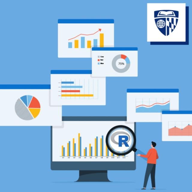
Data visualization is especially important today with the increased amount and velocity of data that companies capture daily, and a system is needed to ingest and make sense of all this data for improved decision-making. This course provides a comprehensive understanding of data visualization within the context of business intelligence.

Class Deals by MOOC List - Click here and see Coursera's Active Discounts, Deals, and Promo Codes.

It begins by covering the foundational concepts, advantages, and risks associated with data visualization We then shift our focus to the specialized tool Qlik Sense, examining its key features, competitive advantages, workflow, and terminology. Finally, the course provides hands-on experience creating simple interactive visualizations using real-life data.
As a foundational course of a series of three Qlik Sense learning opportunities, "Introduction to Data Visualization" sets the foundation, introducing you to the art and science of visualizing data effectively. In "Exploration and Visualization with Qlik Sense," you'll go deeper, honing your skills in navigating and presenting data with this powerful tool. Finally, "Advanced Data Analysis and Collaboration" takes your expertise to new heights, equipping you with advanced techniques to analyze and collaborate on data-driven insights. Whether you are beginning the journey or an experienced data enthusiast, this series offers a seamless transition from fundamentals to advanced proficiency, ensuring you're well-equipped to excel in the world of data visualization.
This program is designed for anyone interested in data visualization. This includes data analysts and project managers, who want to present a story or an argument through data, or individuals who want to simply take a dataset and create actionable graphs from it using Qlik Sense.
Learners should ideally possess the following prerequisite skills: Basic Excel knowledge or other spreadsheet software; understanding of data statistic fundamentals such as mean, sum, etc.; and an active learning mindset.

What you'll learn

  • Data viz simplifies complex info visually, aiding BI for better decisions, but beware of misinterpretation risks.
  • Students achieve Qlik Sense proficiency, grasping its features, use cases, workflow, and terms for a competitive edge in data visualization.
  • Create simple interactive data visualizations from real-world datasets that address specific business questions

Syllabus

Introduction to Data Visualization with Qlik Sense
Upon completion of this course, you will be equipped with a solid understanding of the principles of data visualization and its role in business intelligence. These new skills will ultimately improve communication, decision making and efficiency across job functions and projects. You will also gain expertise in using Qlik Sense, a leading data visualization tool, and be capable of creating interactive and insightful visualizations from real-world data to address specific business questions. This skill set will enable you to make data-driven decisions and provide valuable insights in a business environment.

Go to Class
MOOC List is learner-supported. When you buy through links on our site, we may earn an affiliate commission.

Related Courses

Demand Analytics (Coursera) Coursera
Rutgers University

Demand Analytics (Coursera)

Welcome to Demand Analytics - one of the most sought-after skills in supply chain management and marketing! Through the real-life story and data of a leading cookware manufacturer in North America, you will learn the data analytics skills for demand planning and forecasting.

Jun 1st 2026
4 Weeks
Introduction to the Tidyverse (Coursera) Coursera
Johns Hopkins University

Introduction to the Tidyverse (Coursera)

This course introduces a powerful set of data science tools known as the Tidyverse. The Tidyverse has revolutionized the way in which data scientists do almost every aspect of their job. We will cover the simple idea of "tidy data" and how this idea serves to organize data for analysis and modeling. We will also cover how non-tidy can be transformed to tidy data, the data science project life cycle, and the ecosystem of Tidyverse R packages that can be used to execute a data science project.

Jun 1st 2026
4 Weeks
Dashboarding and Deployment (Coursera) Coursera
University of California, Irvine

Dashboarding and Deployment (Coursera)

This course will take you through the various parts of analytical dashboarding: from best practices for designing a dashboard, creating a unified analytical environment, to deploying and publishing visualizations. We will briefly discuss the advanced visualization techniques and you will develop an information layout of the biggest gainers and losers in the financial markets and compare those movements to the economic data as your capstone project.

Jun 1st 2026
4 Weeks
Data Visualization with R (Coursera) Coursera
IBM

Data Visualization with R (Coursera)

In this course, you will learn the Grammar of Graphics, a system for describing and building graphs, and how the ggplot2 data visualization package for R applies this concept to basic bar charts, histograms, pie charts, scatter plots, line plots, and box plots. You will also learn how to further customize your charts and plots using themes and other techniques. You will then learn how to use another data visualization package for R called Leaflet to create map plots, a unique way to plot data based on geolocation data. Finally, you will be introduced to creating interactive dashboards using the R Shiny package.

Jun 1st 2026
4 Weeks
Data Science Companion (Coursera) Coursera
MathWorks

Data Science Companion (Coursera)

The Data Science Companion provides an introduction to data science. You will gain a quick background in data science and core machine learning concepts, such as regression and classification. You’ll be introduced to the practical knowledge of data processing and visualization using low-code solutions, as well as an overview of the ways to integrate multiple tools effectively to solve data science problems.

Jun 5th 2026
4 Weeks
Exploratory Data Analysis with MATLAB (Coursera) Coursera
MathWorks

Exploratory Data Analysis with MATLAB (Coursera)

In this course, you will learn to think like a data scientist and ask questions of your data. You will use interactive features in MATLAB to extract subsets of data and to compute statistics on groups of related data. You will learn to use MATLAB to automatically generate code so you can learn syntax as you explore. You will also use interactive documents, called live scripts, to capture the steps of your analysis, communicate the results, and provide interactive controls allowing others to experiment by selecting groups of data.

Jun 1st 2026
5-12 Weeks
Publishing Visualizations in R with Shiny and flexdashboard (Coursera) Coursera
Johns Hopkins University

Publishing Visualizations in R with Shiny and flexdashboard (Coursera)

This course is the fourth in the Specialization "Data Visualization and Dashboarding in R." Learners will come to this course with a strong background in making visualization in R using ggplot2. To build on those skills, this course covers creating interactive visualization using Shiny, as well as combining different kinds of figures made in R into interactive dashboards. Data visualization is a critical skill for anyone that routinely using quantitative data in his or her work - which is to say that data visualization is a tool that almost every worker needs today.

Jun 1st 2026
3 Weeks
Data Visualization (Coursera) Coursera
Ball State University

Data Visualization (Coursera)

In the era of big data, acquiring the ability to analyze and visually represent “Big Data” in a compelling manner is crucial. Therefore, it is essential for data scientists to develop the skills in producing and critically interpreting digital maps, charts, and graphs. Data visualization is an increasingly important topic in our globalized and digital society. It involves graphically representing data or information, enabling decision-makers across various industries to comprehend complex concepts and processes that may otherwise be challenging to grasp.

Jun 2nd 2026
5-12 Weeks
Data Visualization in Excel (Coursera) Coursera
Macquarie University

Data Visualization in Excel (Coursera)

In an age now driven by "big data", we need to cut through the noise and present key information in a way that can be quickly consumed and acted upon making data visualization an increasingly important skill. Visualizations need to not only present data in an easy to understand and attractive way, but they must also provide context for the data, tell a story, achieving that fine balance between form and function. Excel has many rivals in this space, but it is still an excellent choice, particularly if it's where your data resides. It offers a wealth of tools for creating visualizations other than charts and the chart options available are constantly increasing and improving, so the newer versions now include waterfall charts, sunburst diagrams and even map charts. But what sets Excel apart is its flexibility, it gives us total creative control over our designs so if needed we could produce our own animated custom chart to tell the right story for our data.

Jun 1st 2026
5-12 Weeks
Data Visualization and Dashboards with Excel and Cognos (Coursera) Coursera
IBM

Data Visualization and Dashboards with Excel and Cognos (Coursera)

This course covers some of the first steps in the development of data visualizations using spreadsheets and dashboards. Begin the process of telling a story with your data by creating the many types of charts that are available in spreadsheets like Excel. Explore the different tools of a spreadsheet, such as the important pivot function and the ability to create dashboards and learn how each one has its own unique property to transform your data.

Jun 1st 2026
4 Weeks
Data Management and Visualisation (Coursera) Coursera
Wesleyan University

Data Management and Visualisation (Coursera)

Whether being used to customize advertising to millions of website visitors or streamline inventory ordering at a small restaurant, data is becoming more integral to success. Too often, we’re not sure how use data to find answers to the questions that will make us more successful in what we do. In this course, you will discover what data is and think about what questions you have that can be answered by the data – even if you’ve never thought about data before. Based on existing data, you will learn to develop a research question, describe the variables and their relationships, calculate basic statistics, and present your results clearly.

Jun 1st 2026
4 Weeks
Python Data Visualization (Coursera) Coursera
Rice University

Python Data Visualization (Coursera)

This if the final course in the specialization which builds upon the knowledge learned in Python Programming Essentials, Python Data Representations, and Python Data Analysis. We will learn how to install external packages for use within Python, acquire data from sources on the Web, and then we will clean, process, analyze, and visualize that data. This course will combine the skills learned throughout the specialization to enable you to write interesting, practical, and useful programs.

Jun 1st 2026
4 Weeks