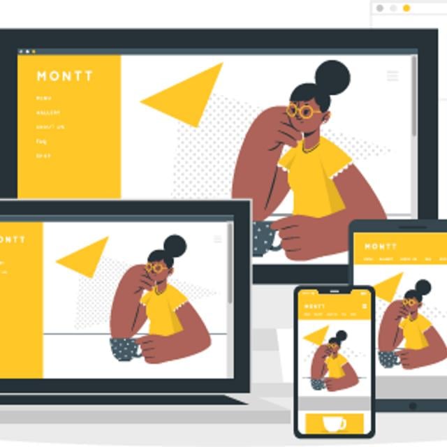
Great Experiences on Any Device. In this course you'll learn the fundamentals of responsive web design with Google's Pete LePage! You'll create your own responsive web page that works well on any device - phone, tablet, desktop or anything in between.
Class Deals by MOOC List - Click here and see Udacity's Active Discounts, Deals, and Promo Codes.
You’ll start by exploring what makes a site responsive and how some common responsive design patterns work across different devices. From there, you’ll learn how to create your own responsive layout using the viewport tag and CSS media queries. As you proceed, you’ll experiment with major and minor breakpoints, and optimizing text for reading.
The way people browse the web is changing quickly - fewer and fewer users access the web at a desk in front of a large monitor with a keyboard and mouse. The web is increasingly being enjoyed on phones, tablets, wearables, TVs and everything in between. By designing a site to be responsive, it will look good and work well no matter what device your users have in front of them.
Throughout this course, you'll work through a project creating a home town website that works well on phones, tablets and desktop displays.
What You Will Learn
Lesson 1
Why Responsive
- Introduction to responsive design with Pete LePage.
- Why does responsive design work for any device?
- Remote debugging and emulation in the browser.
Lesson 2
Starting Small
- What is the viewport?
- Learn about sizing the content to the viewport.
- Touch targets and why they should be large.
Lesson 3
Building Up
- How to take advantage of CSS media queries.
- What is a breakpoint and how to choose one.
- How to use the CSS flexbox to modify layout.
Lesson 4
Common Responsive Patterns
- How to apply the mostly fluid pattern.
- How to apply the column drop pattern.
- How to apply layout shifter pattern.
Lesson 5
Optimizations
- Using minor break points.
- How to optimize text layout.
- How to use responsive tables and strategies for dealing with them.
Prerequisites and Requirements
You should be comfortable reading and writing HTML and CSS. You should also be able to inspect and modify websites using browser developer tools (we use Google Chrome, but you should be able to accomplish all the tasks in this course with any browser's developer tools).If you are unfamiliar with HTML and CSS, or if feel like you need to brush up on them, start with our Intro to HTML and CSS.You will not need to write JavaScript for this course.