Fundamentals of Data Visualization (Coursera)

Fundamentals of Data Visualization (Coursera)

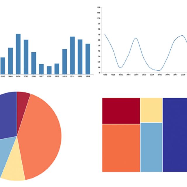
Data is everywhere. Charts, graphs, and other types of information visualizations help people to make sense of this data. This course explores the design, development, and evaluation of such information visualizations. By combining aspects of design, computer graphics, HCI, and data science, you will gain hands-on experience with creating visualizations, using exploratory tools, and architecting data narratives. Topics include user-centered design, web-based visualization, data cognition and perception, and design evaluation.

Class Deals by MOOC List - Click here and see Coursera's Active Discounts, Deals, and Promo Codes.

This course can be taken for academic credit as part of CU Boulder’s Master of Science in Data Science (MS-DS) degree offered on the Coursera platform. The MS-DS is an interdisciplinary degree that brings together faculty from CU Boulder’s departments of Applied Mathematics, Computer Science, Information Science, and others. With performance-based admissions and no application process, the MS-DS is ideal for individuals with a broad range of undergraduate education and/or professional experience in computer science, information science, mathematics, and statistics.

What You Will Learn

  • Develop a toolkit for exploring and communicating complex data using visualization
  • Produce basic data visualizations using a chosen dataset
  • Compare methods for visualizing data and understand how these methods may guide users towards different conclusions
  • Evaluate how effectively a visualization conveys target data

Course 4 of 4 in the Vital Skills for Data Science Specialization

Syllabus

WEEK 1
Basics of Design
In this module, you will learn the foundations of visualization design. You will walk through the key components of a visualization, how we effectively represent data using channels like color, size, and position, and some ground rules for honest and effective visualization. You will also gain preliminary exposure to Altair, a Python library for rapidly generating interactive visualizations. Each week will also include either two readings or one reading and one notebook activity.

WEEK 2
User Needs
In this module, you will learn how to choose the right visualization for a given scenario. You will learn how to reason about the different kinds of questions people ask with visualization and, how to align your design with that task. The module will cover basics of task analysis, methods for task elicitation, and foundational knowledge of visual perception for design. Each week will also include two external readings or one reading and one notebook activity.

WEEK 3
Evaluation
In this module, you will learn how to assess the effectiveness of your visualization. You will learn both qualitative and quantitative approaches for evaluating visualizations as well as how to isolate key elements for assessment and iteration. The module will cover basics of insight-based evaluation, interview studies, and experimental design and analysis. Each week will also include two external readings or one reading and one notebook activity.

Go to Class
MOOC List is learner-supported. When you buy through links on our site, we may earn an affiliate commission.

Related Courses

Julia Scientific Programming (Coursera) Coursera
University of Cape Town

Julia Scientific Programming (Coursera)

This four-module course introduces users to Julia as a first language. Julia is a high-level, high-performance dynamic programming language developed specifically for scientific computing. This language will be particularly useful for applications in physics, chemistry, astronomy, engineering, data science, bioinformatics and many more.

Oct 12th 2026
4 Weeks
Introduction to Business Analytics: Communicating with Data (Coursera) Coursera
University of Illinois at Urbana-Champaign

Introduction to Business Analytics: Communicating with Data (Coursera)

This course introduces students to the science of business analytics while casting a keen eye toward the artful use of numbers found in the digital space. The goal is to provide businesses and managers with the foundation needed to apply data analytics to real-world challenges they confront daily in their professional lives.

Oct 5th 2026
4 Weeks
3D Data Visualization for Science Communication (Coursera) Coursera
University of Illinois at Urbana-Champaign

3D Data Visualization for Science Communication (Coursera)

This course is an introduction to 3D scientific data visualization, with an emphasis on science communication and cinematic design for appealing to broad audiences. You will develop visualization literacy, through being able to interpret/analyze (read) visualizations and create (write) your own visualizations.

Oct 5th 2026
4 Weeks
Applied Plotting, Charting & Data Representation in Python (Coursera) Coursera
University of Michigan

Applied Plotting, Charting & Data Representation in Python (Coursera)

This course will introduce the learner to information visualization basics, with a focus on reporting and charting using the matplotlib library. The course will start with a design and information literacy perspective, touching on what makes a good and bad visualization, and what statistical measures translate into in terms of visualizations. The second week will focus on the technology used to make visualizations in python, matplotlib, and introduce users to best practices when creating basic charts and how to realize design decisions in the framework.

Oct 5th 2026
4 Weeks
Gen AI for Code Generation for Python (Coursera) Coursera
Edureka

Gen AI for Code Generation for Python (Coursera)

Welcome to the 'Gen AI for Code Generation for Python' course, where you'll embark on a journey to explore and develop your skills in the art of code generation with Generative AI. Throughout this short course, you will delve into various techniques for generating Python code effortlessly, ranging from simple scripts to complete end-to-end projects.

Oct 12th 2026
1 Week
Data – What It Is, What We Can Do With It (Coursera) Coursera
Johns Hopkins University

Data – What It Is, What We Can Do With It (Coursera)

This course introduces students to data and statistics. By the end of the course, students should be able to interpret descriptive statistics, causal analyses and visualizations to draw meaningful insights. The course first introduces a framework for thinking about the various purposes of statistical analysis. We’ll talk about how analysts use data for descriptive, causal and predictive inference. We’ll then cover how to develop a research study for causal analysis, compute and interpret descriptive statistics and design effective visualizations. The course will help you to become a thoughtful and critical consumer of analytics.

Oct 5th 2026
4 Weeks
Matlab and Simulink Basics (Coursera) Coursera
Starweaver

Matlab and Simulink Basics (Coursera)

Matlab and Simulink Basics is a meticulously crafted course offering a comprehensive introduction to Matlab's programming environment and Simulink's modeling capabilities. This course is tailored for individuals keen on bolstering their skills in these indispensable tools for engineering, science, and research domains. From laying down foundational concepts to delving into practical applications, participants will embark on a journey that hones their abilities to manipulate data, design models, and interpret results with Matlab and Simulink.

Oct 12th 2026
4 Weeks
Introduction to Data Visualization in Qlik Sense (Coursera) Coursera
Coursera Instructor Network

Introduction to Data Visualization in Qlik Sense (Coursera)

Data visualization is especially important today with the increased amount and velocity of data that companies capture daily, and a system is needed to ingest and make sense of all this data for improved decision-making. This course provides a comprehensive understanding of data visualization within the context of business intelligence.

Oct 12th 2026
1 Week
Understanding and Visualizing Data with Python (Coursera) Coursera
University of Michigan

Understanding and Visualizing Data with Python (Coursera)

In this course, learners will be introduced to the field of statistics, including where data come from, study design, data management, and exploring and visualizing data. Learners will identify different types of data, and learn how to visualize, analyze, and interpret summaries for both univariate and multivariate data. Learners will also be introduced to the differences between probability and non-probability sampling from larger populations, the idea of how sample estimates vary, and how inferences can be made about larger populations based on probability sampling.

Oct 5th 2026
4 Weeks
Building Data Visualization Tools (Coursera) Coursera
Johns Hopkins University

Building Data Visualization Tools (Coursera)

The data science revolution has produced reams of new data from a wide variety of new sources. These new datasets are being used to answer new questions in way never before conceived. Visualization remains one of the most powerful ways draw conclusions from data, but the influx of new data types requires the development of new visualization techniques and building blocks. This course provides you with the skills for creating those new visualization building blocks.

Oct 5th 2026
4 Weeks
Business intelligence and data analytics: Generate insights (Coursera) Coursera
Macquarie University

Business intelligence and data analytics: Generate insights (Coursera)

‘Megatrends’ heavily influence today’s organisations, industries and societies, and your ability to generate insights in this area is crucial to your organisation’s success into the future. This course will introduce you to analytical tools and skills you can use to understand, analyse and evaluate the challenges and opportunities ‘megatrends’ will inevitably bring to your organisation.

Oct 19th 2026
5-12 Weeks
Accounting Data Analytics with Python (Coursera) Coursera
University of Illinois at Urbana-Champaign

Accounting Data Analytics with Python (Coursera)

This course focuses on developing Python skills for assembling business data. It will cover some of the same material from Introduction to Accounting Data Analytics and Visualization, but in a more general purpose programming environment (Jupyter Notebook for Python), rather than in Excel and the Visual Basic Editor. These concepts are taught within the context of one or more accounting data domains (e.g., financial statement data from EDGAR, stock data, loan data, point-of-sale data).

Oct 12th 2026
5-12 Weeks