Data Visualization with R (Coursera)

Offered by IBM,
Data Visualization with R (Coursera)

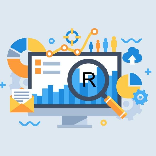
In this course, you will learn the Grammar of Graphics, a system for describing and building graphs, and how the ggplot2 data visualization package for R applies this concept to basic bar charts, histograms, pie charts, scatter plots, line plots, and box plots. You will also learn how to further customize your charts and plots using themes and other techniques. You will then learn how to use another data visualization package for R called Leaflet to create map plots, a unique way to plot data based on geolocation data. Finally, you will be introduced to creating interactive dashboards using the R Shiny package.

Class Deals by MOOC List - Click here and see Coursera's Active Discounts, Deals, and Promo Codes.

You will learn how to create and customize Shiny apps, alter the appearance of the apps by adding HTML and image components, and deploy your interactive data apps on the web.
You will practice what you learn and build hands-on experience by completing labs in each module and a final project at the end of the course.
Watch the videos, work through the labs, and watch your data science skill grow. Good luck!
NOTE: This course requires knowledge of working with R and data. If you do not have these skills, it is highly recommended that you first take the Introduction to R Programming for Data Science as well as the Data Analysis with R courses from IBM prior to starting this course. Note: The pre-requisite for this course is basic R programming skills.
Completing this course will count towards your learning in any of the following programs:

Syllabus

WEEK 1
Introduction to Data Visualization
Data without a way to convey the story behind it to yourself or others is just numbers on a page. You can observe and tell the story of your data in a more impactful way through visualization.
In this module, you will learn the basics of data visualization using R, including the fundamental components that are shared by all charts and plots, and how to bring those components to life using the ggplot2 package for R. You will also learn how to create three common chart types, including bar, histogram, and pie charts, from the qualitative and quantitative data.

WEEK 2
Basic Plots, Maps, and Customization
In this module, you will take your data visualization skills to the next level! You will learn how to create three plot types, including scatter plots, line, plots, and box plots, using the ggplot2 library and then customize the visualizations using annotations and customized axis titles and text labels. You will also learn about faceting, a way to visualize each level of a discrete or categorical variable, and different ways to work with themes. Finally, you will learn about a unique chart type called a map that you can create using geolocation data and the Leaflet library.

WEEK 3
Dashboards
Your data tells a story. You have built the charts and plots that show important relationships between variables, identify outliers and anomalies, and see the trends that can help you predict what the future might bring. Now you want to put these insightful data visualizations at the fingertips of your stakeholders and make it easy to interact with and explore the data. You need a dashboard!
In this module, you will learn why dashboards are important and then build interactive dashboards using the Shiny package for R. You will learn how Shiny dashboards are structured into user interface and server components and then build out these components and develop the logic to make them work together. You will also learn how to deploy your dashboards and provide a way to generate informative reports with R Markdown.

WEEK 4
Final Assignment
Go to Class
MOOC List is learner-supported. When you buy through links on our site, we may earn an affiliate commission.

Related Courses

Applied Plotting, Charting & Data Representation in Python (Coursera) Coursera
University of Michigan

Applied Plotting, Charting & Data Representation in Python (Coursera)

This course will introduce the learner to information visualization basics, with a focus on reporting and charting using the matplotlib library. The course will start with a design and information literacy perspective, touching on what makes a good and bad visualization, and what statistical measures translate into in terms of visualizations. The second week will focus on the technology used to make visualizations in python, matplotlib, and introduce users to best practices when creating basic charts and how to realize design decisions in the framework.

Aug 10th 2026
4 Weeks
Foundations of Data Science: K-Means Clustering in Python (Coursera) Coursera
University of London,Goldsmiths, University of London

Foundations of Data Science: K-Means Clustering in Python (Coursera)

This MOOC, designed by an academic team from Goldsmiths, University of London, will quickly introduce you to the core concepts of Data Science to prepare you for intermediate and advanced Data Science courses. It focuses on the basic mathematics, statistics and programming skills that are necessary for typical data analysis tasks.

Aug 10th 2026
5-12 Weeks
Excel Essentials and Beyond (Coursera) Coursera
Board Infinity

Excel Essentials and Beyond (Coursera)

Dive into "Excel Essentials and Beyond", a comprehensive exploration of Excel, the world's leading spreadsheet tool. This course is thoughtfully crafted for both newcomers to Excel and also for those aiming for mastery. We begin by introducing Excel's robust interface and foundational features, ensuring a firm grasp of data organization techniques. As you advance, you'll delve into data visualization, transforming raw data into captivating stories.

Aug 17th 2026
5-12 Weeks
3D Data Visualization for Science Communication (Coursera) Coursera
University of Illinois at Urbana-Champaign

3D Data Visualization for Science Communication (Coursera)

This course is an introduction to 3D scientific data visualization, with an emphasis on science communication and cinematic design for appealing to broad audiences. You will develop visualization literacy, through being able to interpret/analyze (read) visualizations and create (write) your own visualizations.

Aug 10th 2026
4 Weeks
Materials Data Sciences and Informatics (Coursera) Coursera
Georgia Institute of Technology

Materials Data Sciences and Informatics (Coursera)

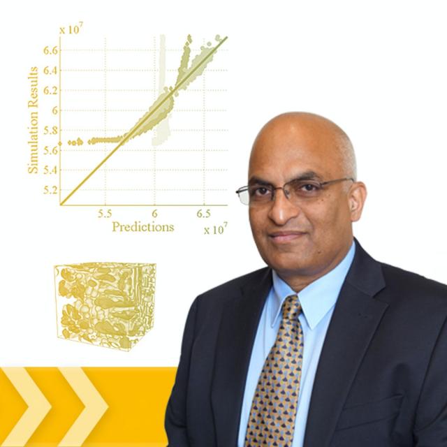
This course aims to provide a succinct overview of the emerging discipline of Materials Informatics at the intersection of materials science, computational science, and information science. Attention is drawn to specific opportunities afforded by this new field in accelerating materials development and deployment efforts.

Aug 10th 2026
5-12 Weeks
Bayesian Statistics: Techniques and Models (Coursera) Coursera
University of California, Santa Cruz

Bayesian Statistics: Techniques and Models (Coursera)

This is the second of a two-course sequence introducing the fundamentals of Bayesian statistics. It builds on the course Bayesian Statistics: From Concept to Data Analysis, which introduces Bayesian methods through use of simple conjugate models. Real-world data often require more sophisticated models to reach realistic conclusions. This course aims to expand our “Bayesian toolbox” with more general models, and computational techniques to fit them.

Aug 10th 2026
5-12 Weeks
Practical Machine Learning on H2O (Coursera) Coursera
H2O.ai

Practical Machine Learning on H2O (Coursera)

In this course, we will learn all the core techniques needed to make effective use of H2O. Even if you have no prior experience of machine learning, even if your math is weak, by the end of this course you will be able to make machine learning models using a variety of algorithms. We will be using linear models, random forest, GBMs and of course deep learning, as well as some unsupervised learning algorithms.

Aug 17th 2026
5-12 Weeks
Population Health: Responsible Data Analysis (Coursera) Coursera
Leiden University

Population Health: Responsible Data Analysis (Coursera)

In most areas of health, data is being used to make important decisions. As a health population manager, you will have the opportunity to use data to answer interesting questions. In this course, we will discuss data analysis from a responsible perspective, which will help you to extract useful information from data and enlarge your knowledge about specific aspects of interest of the population.

Aug 10th 2026
4 Weeks
Interprofessional Healthcare Informatics (Coursera) Coursera
University of Minnesota

Interprofessional Healthcare Informatics (Coursera)

Interprofessional Healthcare Informatics is a graduate-level, hands-on interactive exploration of real informatics tools and techniques offered by the University of Minnesota and the University of Minnesota's National Center for Interprofessional Practice and Education. We will be incorporating technology-enabled educational innovations to bring the subject matter to life. Over the 10 modules, we will create a vital online learning community and a working healthcare informatics network.

Aug 17th 2026
5-12 Weeks
Julia Scientific Programming (Coursera) Coursera
University of Cape Town

Julia Scientific Programming (Coursera)

This four-module course introduces users to Julia as a first language. Julia is a high-level, high-performance dynamic programming language developed specifically for scientific computing. This language will be particularly useful for applications in physics, chemistry, astronomy, engineering, data science, bioinformatics and many more.

Aug 17th 2026
4 Weeks
Visualization for Data Journalism (Coursera) Coursera
University of Illinois at Urbana-Champaign

Visualization for Data Journalism (Coursera)

While telling stories with data has been part of the news practice since its earliest days, it is in the midst of a renaissance. Graphics desks which used to be deemed as “the art department,” a subfield outside the work of newsrooms, are becoming a core part of newsrooms’ operation. Those people (they often have various titles: data journalists, news artists, graphic reporters, developers, etc.) who design news graphics are expected to be full-fledged journalists and work closely with reporters and editors.

Aug 10th 2026
5-12 Weeks
Math for MBA and GMAT Prep (Coursera) Coursera
Emory University

Math for MBA and GMAT Prep (Coursera)

This course gives participants a basic understanding of statistics as they apply in business situations. A fair share of students considering MBA programs come from backgrounds that do not include a large amount of training in mathematics and statistics. Often, students find themselves at a disadvantage when they apply for or enroll in MBA programs. This course will give you the tools to understand how these business statistics are calculated for navigating the built-in formulas that are included in Excel, but also how to apply these formulas in an range of business settings and situations.

Aug 10th 2026
5-12 Weeks